2.0 → 4.75
Ease of use, old design vs new — same participants, same tasks
50%
Fewer clicks to set up early warning — 5 steps down to 2–3
41%
Faster key task time — 2:47 down to 1:38
2.5 yrs
Sole designer on responsive + sensor work through June 2026
Introduction
With 4.4 million users, it's the only earthquake app that offers early warning — alongside post-quake reporting and preparedness tools.
MyShake is built in partnership with USGS and UC Berkeley's Seismology Lab, delivering earthquake alerts seconds before shaking begins across California, Oregon, and Washington. I led a dashboard redesign alongside four other designers and a project manager, conceptualizing the new architecture and co-leading usability testing.
Critical
Alert Near You


ESTIMATED SHAKING ARRIVAL
6
SECONDS
Strength : Moderate to Strong
Noticeable shaking expected. Loose objects may fall
Light
Moderate
Strong
Severe
Burbank
Location
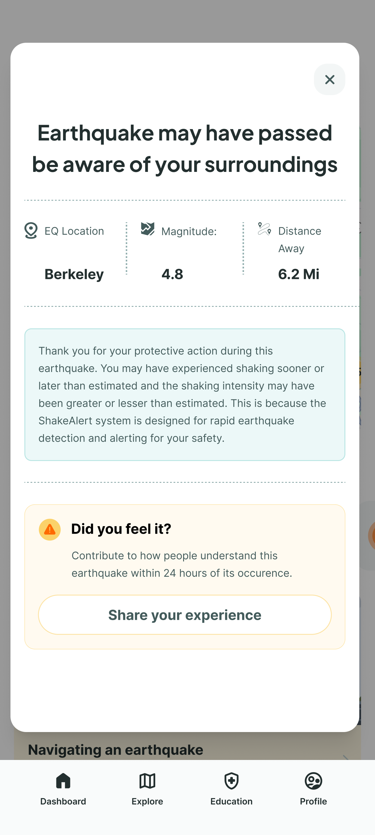
4.8
Magnitude
6.2 mi
Distance
The problem
Despite having life-saving technology, MyShake was losing users.
Despite having life-saving technology, MyShake was losing users. There was only one access point for setting up an early warning alert or a custom earthquake notification — and each took five steps. That's far too complex for a safety app. Our business goal was to make MyShake the #1 earthquake app by increasing engagement and building trust during emergencies.
Research
The key insight: users didn't just want faster access — they wanted to feel like the app was looking out for them.
We surveyed 30 users and analyzed two competitors. The competitive gap was stark, too: other earthquake apps had more users and higher reviews, even though MyShake was the only one offering early warning.
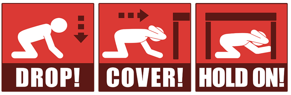
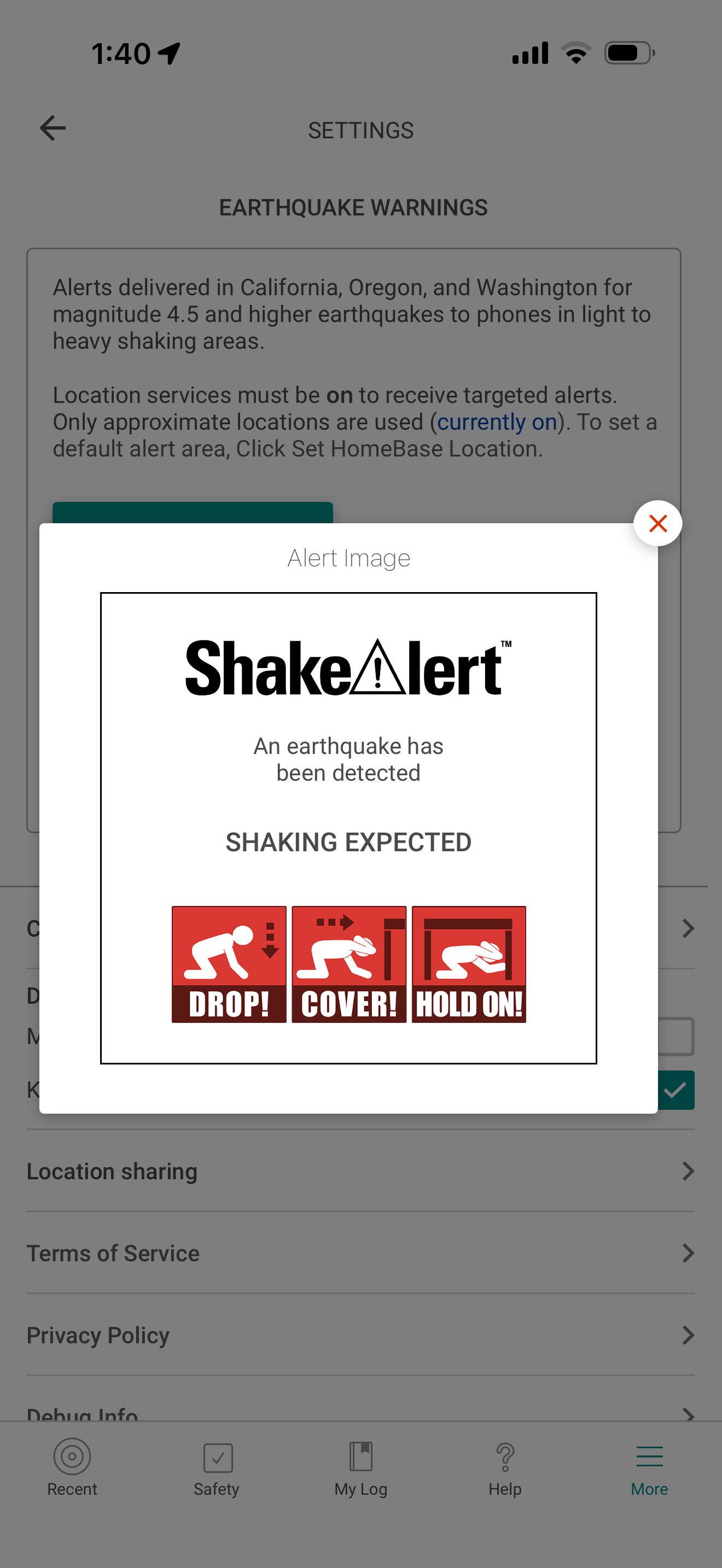
Three needs came out of that research clearly. Users wanted alerts within reach — a way to set up early warnings quickly. They wanted to stay informed about the places that mattered to them, monitoring activity at a glance. And they wanted guidance when it actually mattered — clear, actionable information in the moment an earthquake happens. That last point was underscored by a deeper look at the existing alert: it provided the bare minimum, giving users no sense of when the earthquake would hit or how strong the shaking would be.
Design process
I made the case that a dashboard would solve two pain points at once — faster access and standing out from competitors — and the team agreed to take the risk.
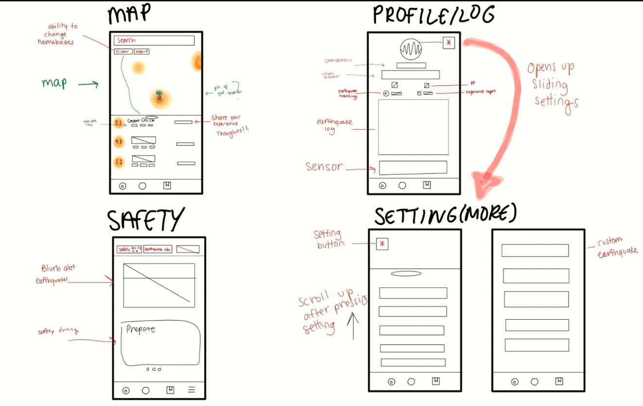
The team started with lo-fi sketches, exploring ways to surface key features — alerts and earthquake information — in something both beautiful and powerful.
I realized every earthquake app, including ours in the early sketches, defaulted to a map-first landing page — a pattern that assumes users want to explore. But our research showed the opposite: users wanted reassurance, not exploration. They wanted to know they were safe, and that the people they cared about were safe. That reframe changed everything, and it's where I proposed making MyShake open to a personalized dashboard instead of a map.
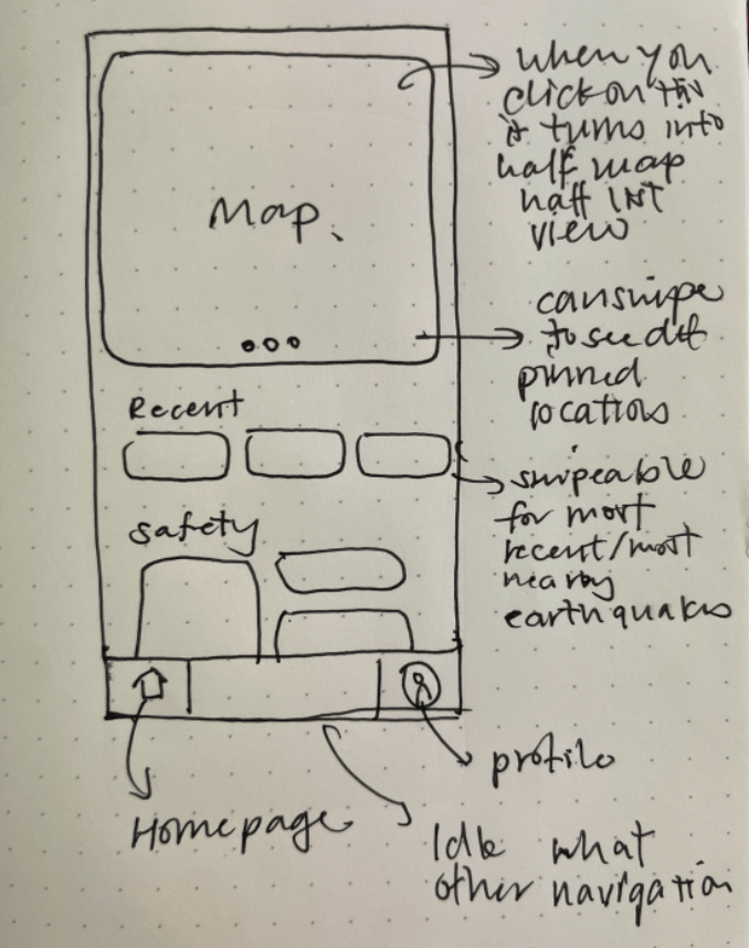
The dashboard introduced real risk. The team was impressed but hesitant — a larger design system would be required, the project timeline was tight, and there was a real risk the Seismology Lab would disapprove. Because of those concerns, the team initially leaned toward simply refining the existing map-first interface: a safer approach, familiar to users, that improved the UI without touching the app's underlying structure.
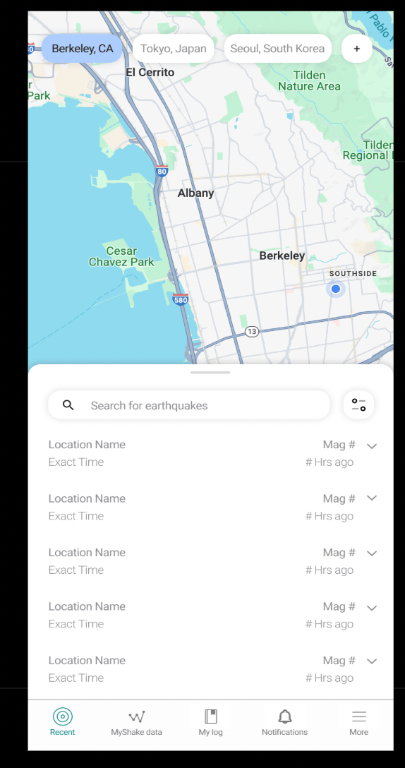
Option A — safer, familiar, visual improvements only
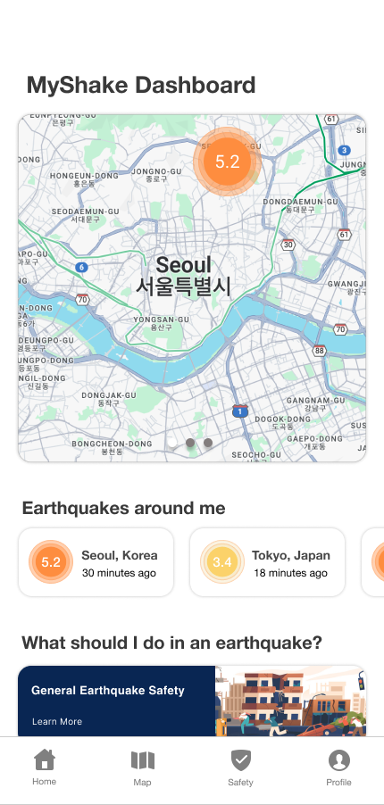
Option B — innovative, personal, unprecedented for earthquake apps
Round three finally settled the argument. I asked participants directly whether they'd prefer a dashboard or a map-first landing page, and three of four chose the dashboard. Their reasoning was about hierarchy and orientation — one said the map didn't tell him what he was looking at, another said map-first “doesn't highlight importance on anything.” The one who preferred map-first found the dashboard had too much information.
Done right, it would transform MyShake from a flat safety app into something that actually felt like it cared about its users. The new information architecture that followed simplified navigation so users could reach any key feature within one or two taps, instead of digging through menus.
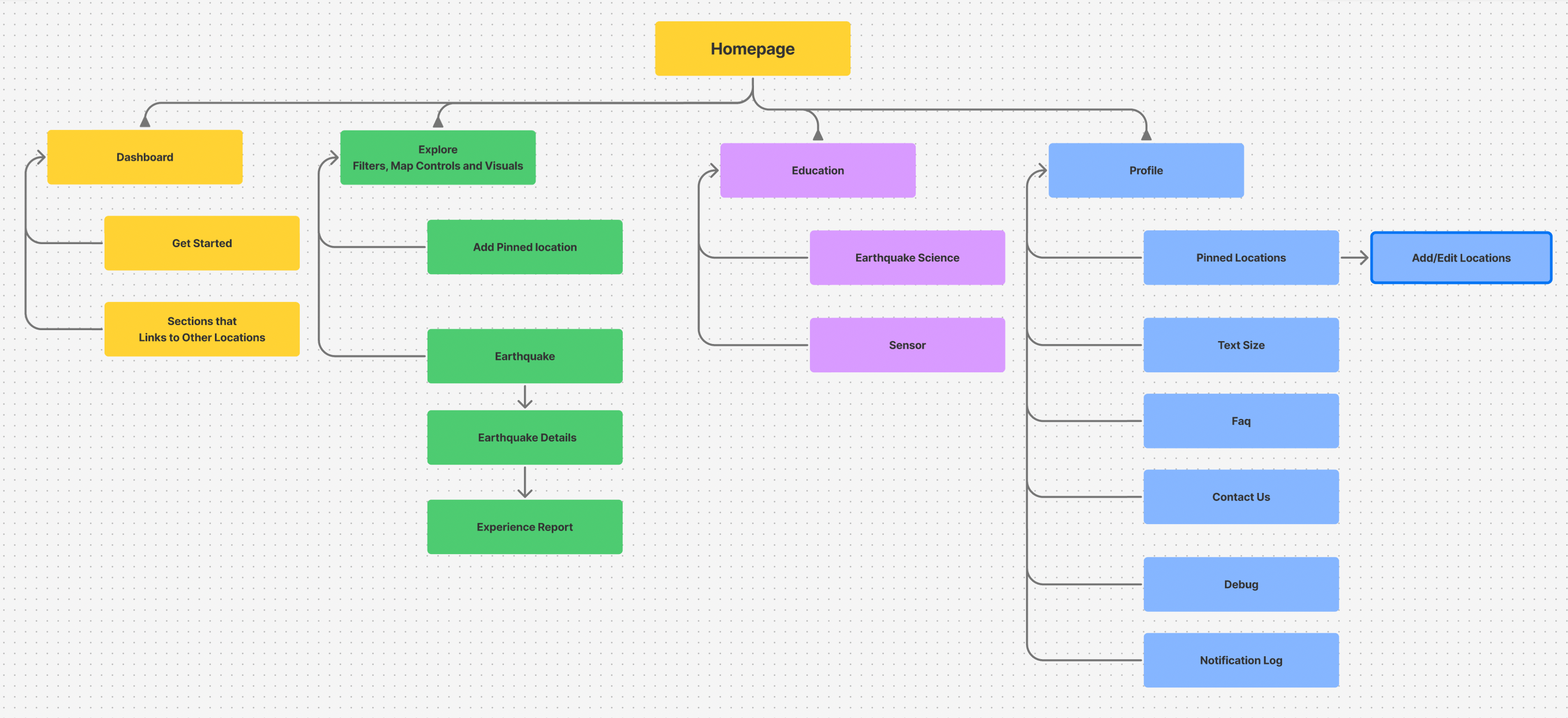
Final solution
First impressions
First impressions mattered, so I designed a short tutorial that introduces the most important parts of the app through progressive disclosure.
Early warning shortcuts
New users get two instant access points to enable an early warning. Setup went from five steps to two — swipe right on the map, or tap the banner.
Staying connected to what matters
The dashboard keeps users informed about the places that matter most to them — whether that's their own home or their mom's apartment across the state. I explored a contact-syncing system for safety confirmations early on, but the Seismology Lab ruled it out of scope: users didn't need MyShake to message family directly, they just needed to know if an earthquake had happened near someone they cared about.
Reimagining the critical alert
The alert itself is MyShake's core moment, and the original showed only basic detection info in an outdated UI. I redesigned both the pre-earthquake warning and the post-earthquake follow-up — adding countdown timers, intensity levels, safety actions, and clear next steps.
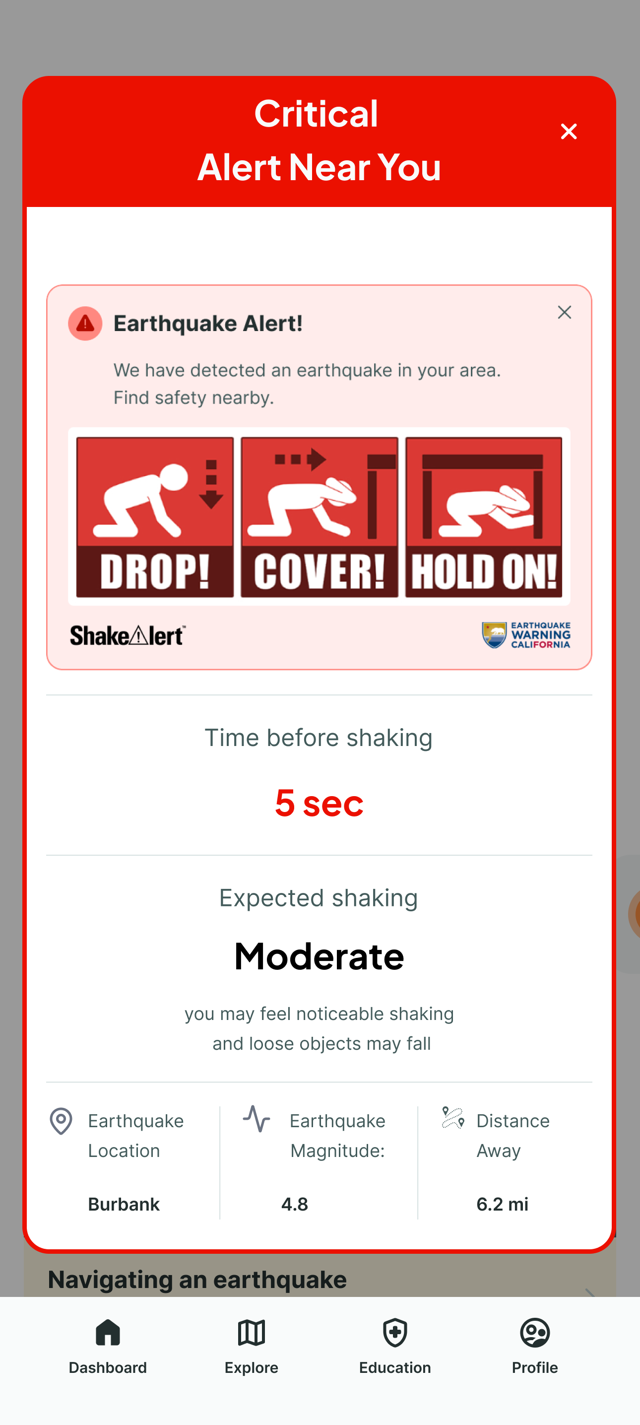
Interface improvements
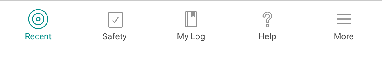
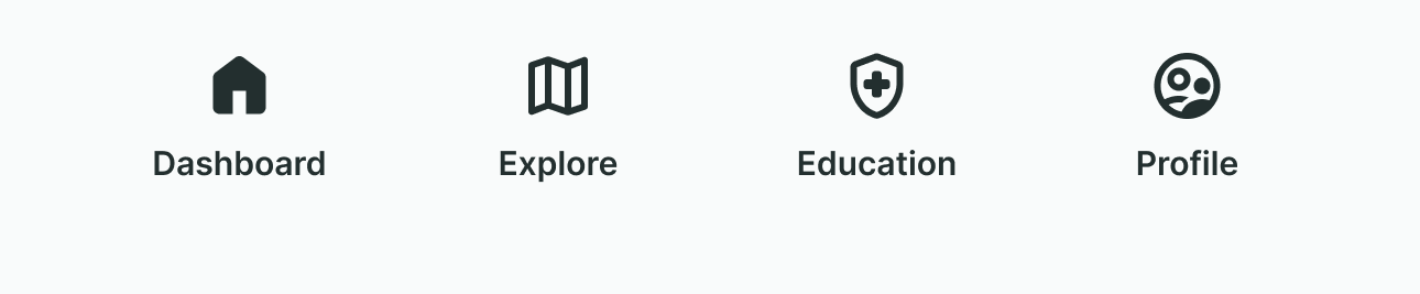
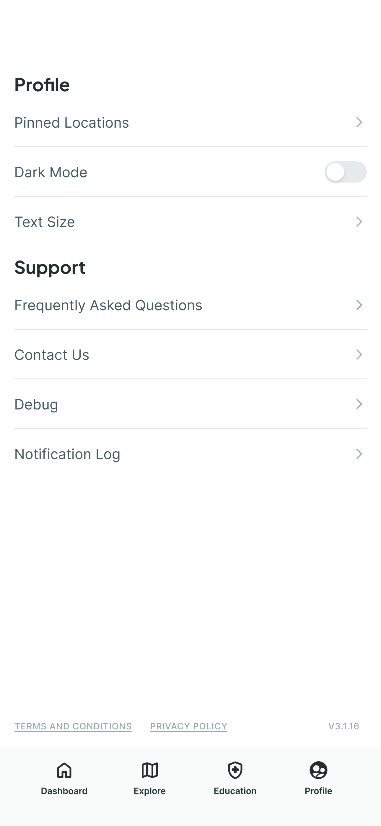
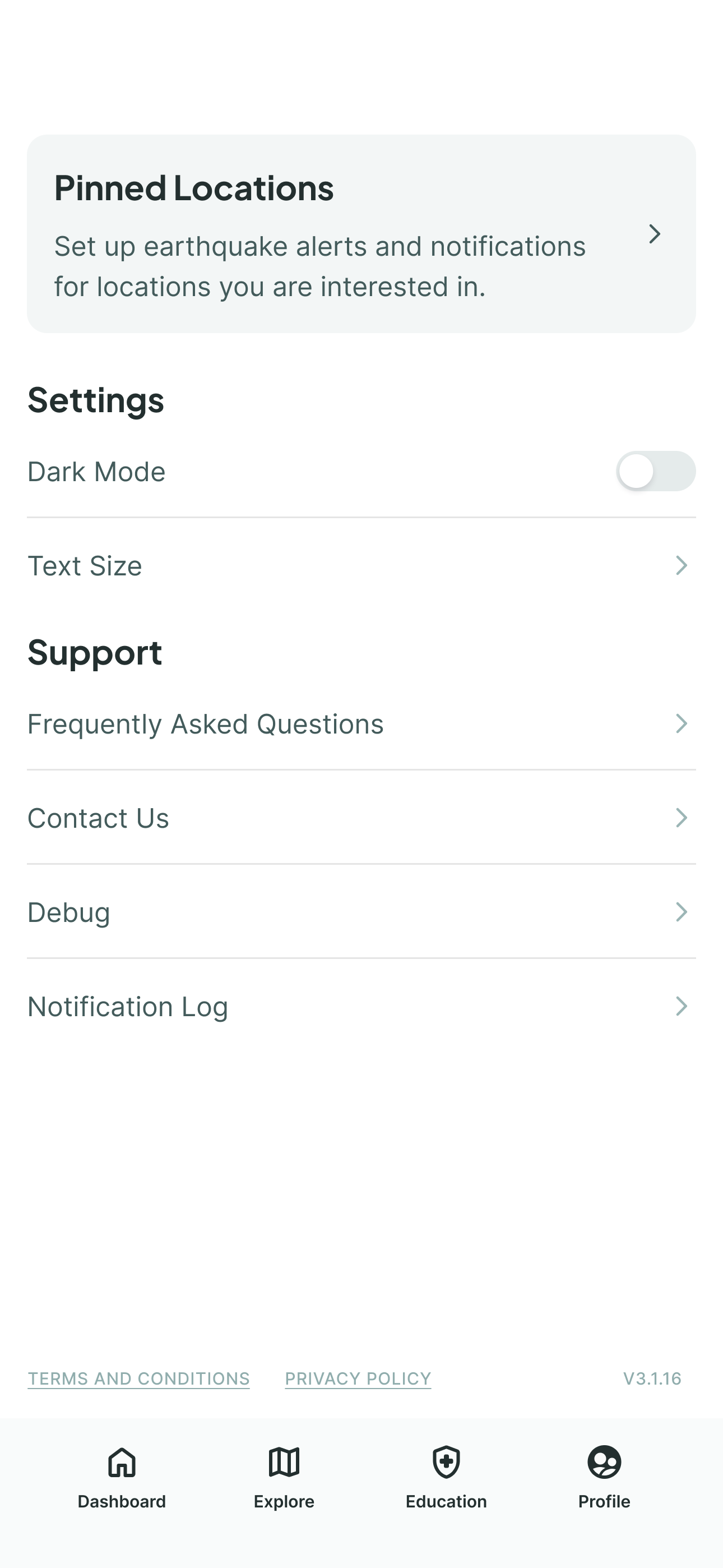
Navigation got more intuitive across the board, and the team reframed the settings screen as a profile page — a small shift that introduced a real sense of ownership and personalization.
Validation
Task success for pinned locations jumped to 100%, up from frequent failures in round one, and ease of use improved to about 4.0 — matching the seniors' round-one ratings.
Three of us ran three rounds of usability testing across 20 participants — young adults and seniors at the Rossmoor retirement community — without the tutorial, and with tasks phrased to genuinely challenge users' thinking. Round one, in November 2024, had 12 participants split evenly between seniors and young adults; I co-led it with the team. Young adults averaged roughly 3.3 out of 5 for ease of use and seniors averaged around 4.0. Users struggled to create pinned locations, buttons were hard to see in some flows, and icons like layers and filters weren't intuitive.
Round two, in December 2024, brought in 4 young-adult participants; I co-led this one too. I added visibility for pinned locations on the profile screen and improved the pinned location flow. One senior participant put it simply:
“It is giving me immediate choices.”
That comment directly validated the dashboard approach. Round-one testing had revealed that users couldn't find pinned locations even with the dashboard shortcuts in place — some clicked into profile and found it buried as a regular menu item. I designed an elevated, prominent banner card instead, making its purpose immediately clear.
For a third round, I tested alone: 4 young adults, the same two tasks, but this time head to head — each participant ran both the old design and the new one, timed, back to back. Ease of use went from 2.0 to 4.75. Overall experience went from 2.25 to 4.25. And the key task — setting up an early warning — dropped from 2:47 to 1:38, a 41% improvement. Rounds one and two only ever tested the new design on its own; round three was the first time I could say the redesign was faster and preferred, not just usable.
What I learned
The hardest part of this project wasn't designing the dashboard — it was convincing the team to take the risk on it.
The hardest part of this project wasn't designing the dashboard — it was convincing the team to take the risk on it. I made the case with research, and that shifted the conversation. I went on to become the sole product designer on MyShake, continuing that work by expanding responsive design and building new features that made earthquake preparedness more accessible to everyone.