Music tools organize by metadata. Title, artist, date added. But that's not how we experience music — we experience it as feeling. This song is dark and driving, that one is bright and weightless. As an EDM listener I kept wanting to answer a question my library couldn't: what does my taste actually look like?
Orion maps a music library spatially. Every song sits on a 2D canvas positioned by its audio features, so proximity means similarity. You explore by feeling, then build DJ sets by wiring songs into a route across that space.
Quantifying vibe
That single translation is what makes the map feel like taste instead of data.
I started building against Spotify's audio features API and found out it no longer exists. Deprecated, and new developer apps are capped at five users, which kills any public product built on their data. I moved to SoundNet, a name-based analysis API, and cached every result so a track is only ever analyzed once.
The more interesting decision was language. SoundNet hands back terms like valence and danceability, which are API words, not human words. Nobody hears a song and thinks “high valence,” so I made a rule that the interface would never show a single API term.
The axes read as vibes, not measurements.
Name-based search doesn't resolve everything. On a 200-song import roughly forty tracks come back with no match — remixes, recent releases, messy metadata. I could have plotted those at a best guess and nobody would ever have caught it, but that's the one thing this product can't do. They route to their own panel with a count at the map's edge. A song is either where it belongs or it isn't on the map.
Making the map legible
Songs always occupy their true positions. If the map lies about where a song lives, the thesis collapses.
Then I loaded 150 house tracks, expecting to finally see the shape of my taste, and got a smudge.
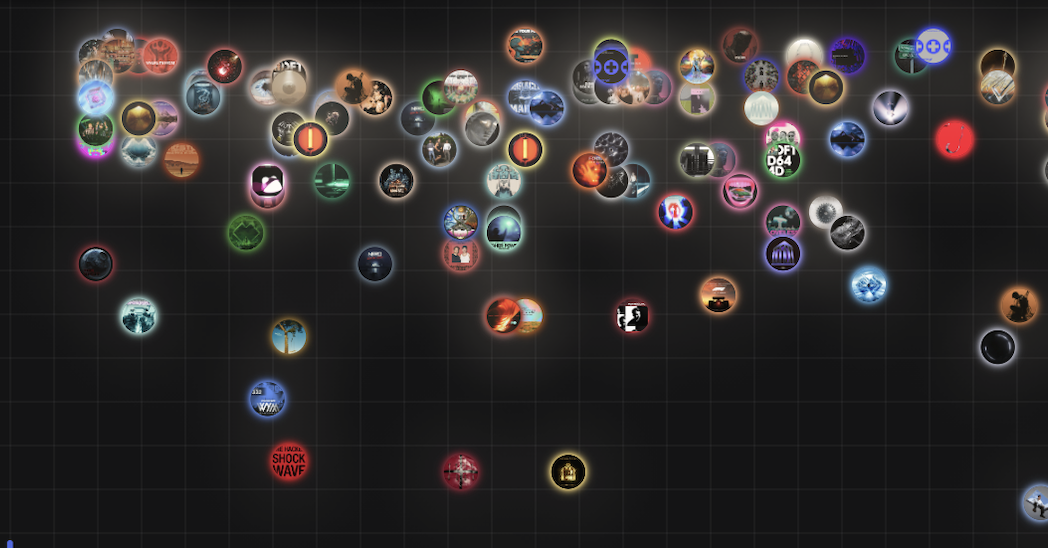
150 house tracks, collapsed
House music clusters by nature — energy, mood, BPM and danceability all sit in narrow ranges. SoundNet also rounds every feature to an integer, so two songs at 75 and 76 energy ended up 60px apart on a 6,000px canvas with nothing to break the tie.
The standard fix is a force-directed layout: let the songs push each other apart until everything is readable. I couldn't use it. Force-directed layouts move points off their true positions, which is exactly the lie the map isn't allowed to tell. Random spread fails for the same reason. What I needed was legibility without fiction, in three layers.
Stretch the crowded ranges
Eighty of the 150 tracks had energy between 65 and 85, so more than half the library was fighting over a fifth of the canvas while empty ranges got the same space. Histogram equalization gives crowded ranges more room and sparse ranges less. Order never changes, and the scaling is pinned at the quadrant boundary so the four vibe zones stay put.
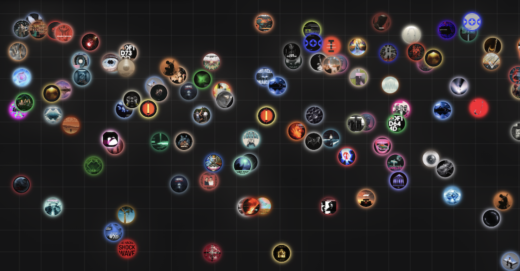
The same library, crowded band stretched
Separate the ties
Rounding means two genuinely different songs both land on 75, and on the same pixel. Each one gets a small offset inside its rounding window, never enough to cross into the next value, seeded by its otherfeatures. Even the nudge carries information, and it's identical on every reload.
Songs whose features really are identical don't get separated at all. Those group into a stack badge: counted, expandable, never hidden.
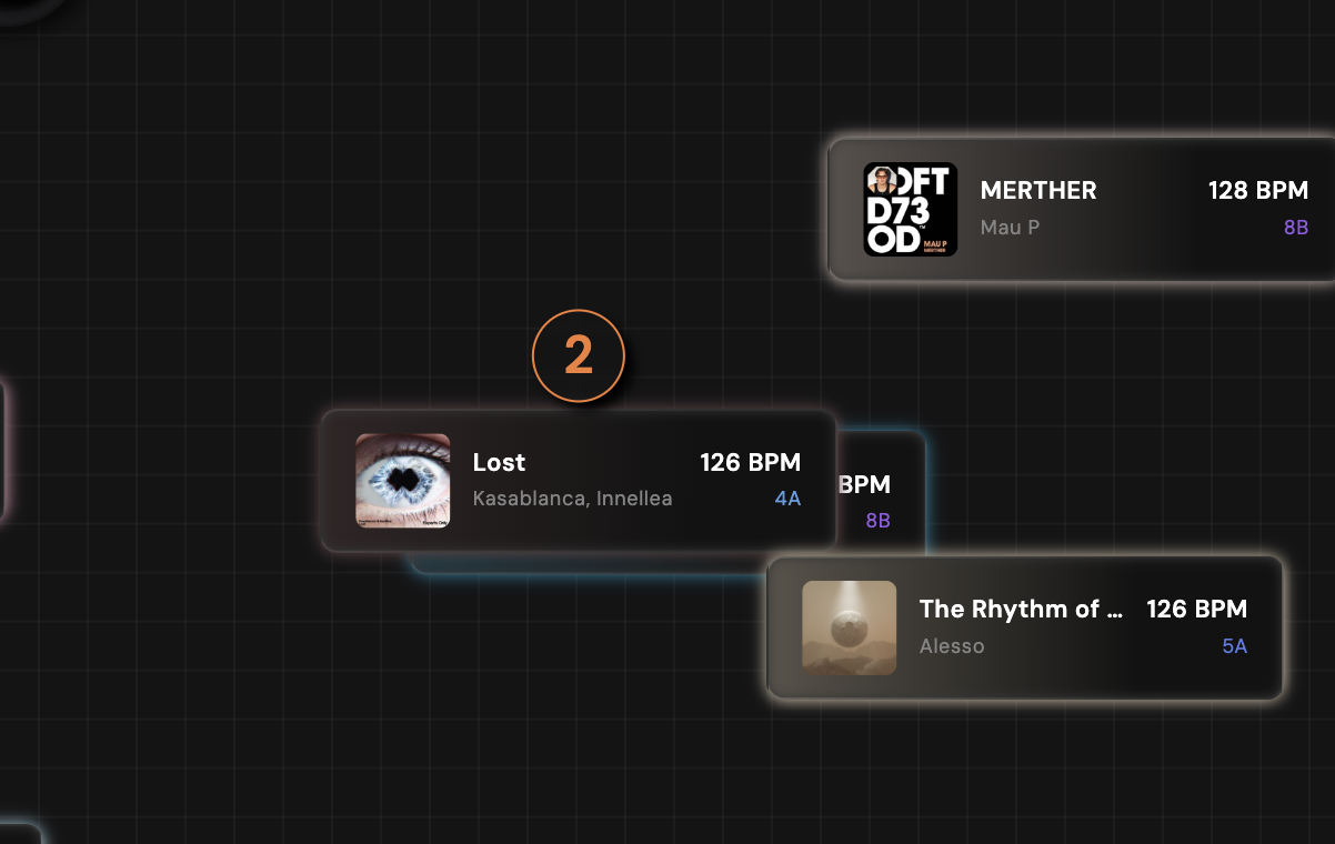
Identical songs group rather than overlap
Make zoom a control for separation
Zooming in doesn't grow the songs. They hold a constant screen size while the canvas spreads beneath them, so pinching adds breathing room instead of magnifying the crowding along with everything else. Overtone solved this in 3D by pairing camera zoom with an inverse image shrink, and I adapted the idea to a 2D canvas.
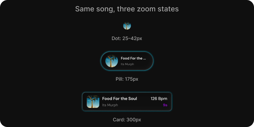
The three node states, specified before they were built.
Every song still sits exactly where its features put it.
Sets as routes
Songs are places, the chain is the path, and you can see at a glance whether your set climbs steadily or whiplashes across quadrants.
Exploring wasn't enough on its own. DJs don't just find songs, they sequence them, and a sequence has a shape — which a playlist UI throws away the moment you commit a song to a list. So I moved set building onto the map itself. Google Maps for a DJ set.
Wires immediately created a problem playlists never face. What happens when you cut one? Deleting everything downstream punishes people for experimenting, so cutting a wire orphans those songs instead: dimmed, dashed, internal wires intact, collected in a Disconnected panel. Even deleting the head just orphans the chain and offers song #2 as the new anchor.
There isn't a confirmation modal anywhere in the app, because no action can lose your work. The same instinct kept Deck View as a side panel rather than its own page.
Two modes, two jobs
Build mode is about decisions. Every wire wears its compatibility color and every candidate glows. But once the set exists, all of that decision-support turns into noise — you don't want to evaluate the set anymore, you want to see it.
Flow mode strips it back. Non-chain songs fade out, wires turn into dark physical cable, and a single pulse of light travels head to tail, tracing the journey in order across vibe space.
Making it speak
Three times, Orion knew something true about a song and said it badly.
Red became coral
I implemented the real DJ compatibility formula — Camelot key relationships plus BPM deltas, weakest-link rule — wired the tiers to green, amber and red, then built my first set and looked at a map that was almost entirely red.
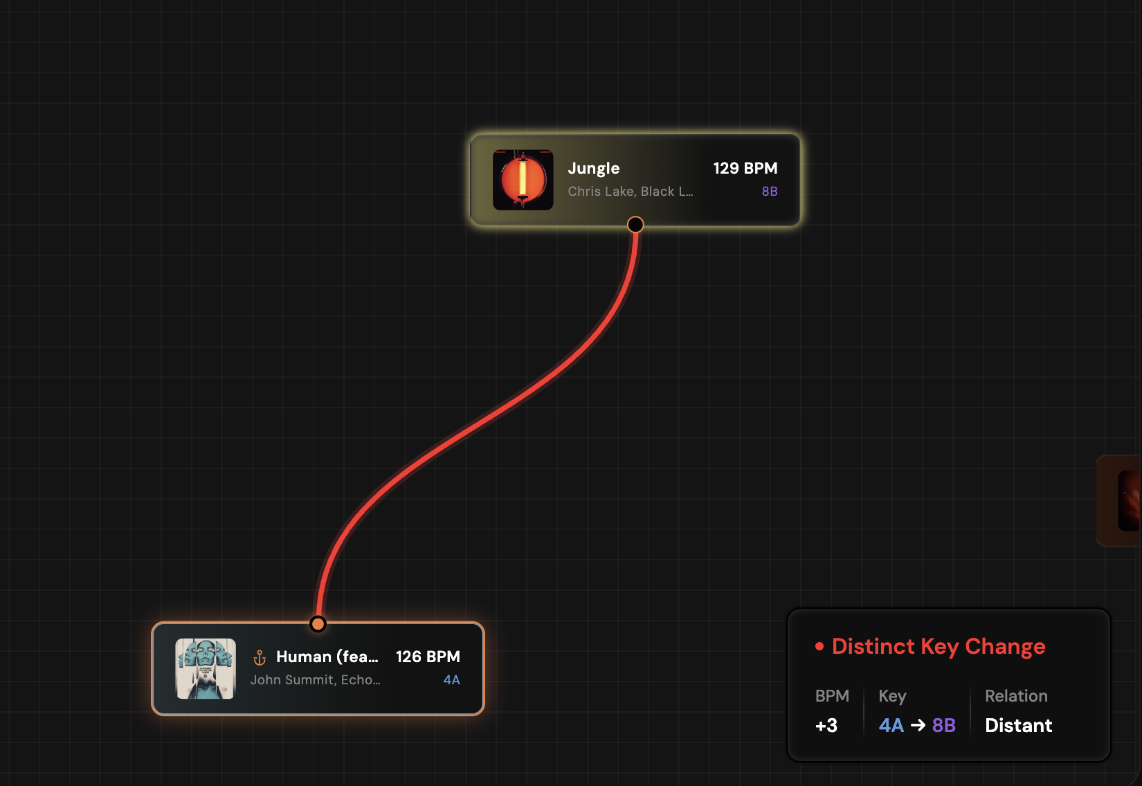
Accurate scoring, alarming output
The scoring was right. The color was telling people they'd made a mistake. Red means danger, and a weak key transition isn't danger, it's a characteristic — DJs make distinct key changes on purpose all the time.
So the formula stayed exactly as strict and the visual language softened instead. Red became a muted coral, and the compatibility card started describing rather than grading: a strong pair is a “smooth harmonic blend,” a weak one a “distinct key change.”
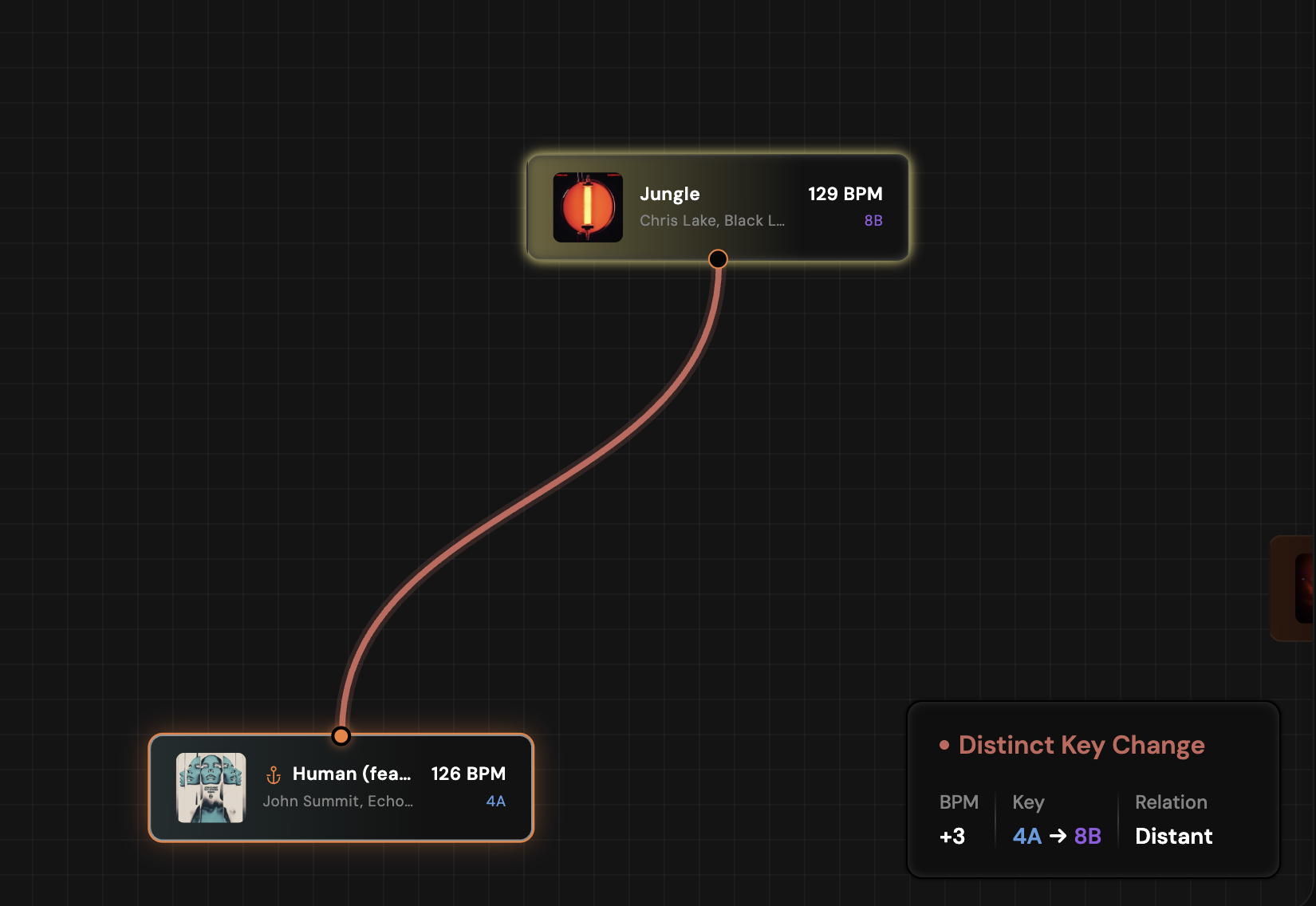
Same information, without the alarm
The visualizer meant nothing
The particle visualizer in Deck View started as decoration. Play two completely different songs and you'd get the same animation with the colors swapped, which bothered me more the longer it sat there.
I spent a weekend building it as a ferrofluid simulation. It looked good in stills, but it never moved like a fluid — the tendrils popped in and out like an urchin instead of flowing, and it barely responded to the track underneath it.
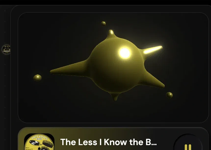
It looked good in stills, but never moved like a fluid
The fix came from a different physical system. Chladni patterns are the figures that form when sand sits on a vibrating plate: change the frequency, get a different figure. That's a system where the sound genuinely produces the form, rather than one where I'm pushing shapes around and hoping they feel musical. I rebuilt the visualizer as a Chladni simulation driven by each song's cached features, so every track settles into its own figure. BPM drives motion, energy drives amplitude, mood shifts color.
A single track's pattern forming
Different songs, different figures
The decoration became identity.
Naming the shape
I put Orion in front of friends before launching it. Flow mode landed — people watched the pulse travel their set and said some version of “oh, that's the shape.” Then I'd ask what the shape was, and they couldn't tell me.
That gap became Journey, a short written summary of a set's trajectory assembled from the same feature data the map already runs on. No language model involved, so the same chain always produces the same sentence.
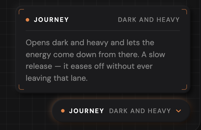
The set's arc, in words
Writing it was mostly subtraction. My first version sounded like a weather report — “moderate energy, balanced mood” — accurate and completely dead. It took a list of banned words and one rule: every sentence has to sound like a person describing a set out loud.
Reflection
Know what the product is for, and let that decide everything else.
I wanted full playback. Then a mixing feature with BPM and key deltas. Then a full-page Deck View. I cut all three — not to save time, but because Orion is for seeing how your songs relate to each other, not for listening to them and not for mixing them. Thirty seconds is plenty to recognize a track and decide where it sits. Mixing belongs in Rekordbox. And the map is the product, so Deck View became a side panel that keeps it under your feet.
Deciding what Orion wasn't for made all three calls easy. Without that, every one of them would have been a reasonable thing to build.